How to Pick the Perfect Color Palette for Your Home: A Warm vs. Cool Guide

Ready to give your home a fresh look?
Get in touch with us today for a consultation, and let’s make your vision a reality.
Categories
Why Does This Matter?
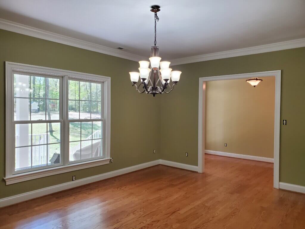
Ever painted a room, stepped back, and thought: “Uh oh… that looks off”? More often than not, it’s because the new paint color clashes with something that’s already in your home—like the wood tones in your floors or the countertops in your kitchen. These permanent fixtures aren’t going anywhere anytime soon, so choosing the right paint colors to compliment (not conflict) with them is super important. That’s where understanding warm and cool color palettes comes in!
Warm vs. Cool: What’s the Difference?
The Color Wheel Basics
Visualize a color wheel split down the middle:
Warm Colors
Red, orange, and yellow. Think fiery sunsets or a cozy campfire. These hues bring energy and vibrancy—perfect if you want your room to feel welcoming and social.
Cool Colors
Blue, green, and purple. Picture a calm lake or a lush forest. These tones create a relaxed, airy vibe, great for spaces where you want to unwind.
Pro Tip:
If a color reminds you of fire or sunlight, it’s warm. If it brings water or sky to mind, it’s cool.
Matching Your Palette to Your Home’s Fixtures
Permanent fixtures—like floors, cabinets, and countertops—are often overlooked when people pick paint colors. But these elements can make or break your room’s flow. Here’s how to navigate it:
Wood Tones & Flooring
- Warm-toned woods (e.g., cherry, mahogany) pair nicely with warm wall colors to enhance that cozy feel.
- Cool or neutral floors (e.g., gray wood, light oak) can pop against cooler walls, giving a modern, refreshing look.
Cabinetry & Countertops
- Warm-colored cabinets/countertops (e.g., cream, beige, brown with warm undertones) look great alongside warm walls, creating a cohesive, inviting atmosphere.
- Cool-toned cabinets/countertops (e.g., white, gray, marble with blueish veining) often shine best next to cooler wall shades, for a clean, contemporary vibe.
Lighting
- Soft or warm lighting makes warm paint colors glow, highlighting their rich undertones.
- Bright or natural lighting can emphasize the crispness of cool tones, creating a light and airy feeling.
Using the Color Wheel as Your Guide
Now that you’ve got a feel for which colors are warm and which are cool, let’s bring the color wheel into the mix. This visual framework makes it easy to see where each hue belongs, so you can quickly spot which colors might work best in your home. Plus, once you recognize where a color lands on the wheel, you’ll have a foolproof way of matching it to your fixtures’ undertones—no more guesswork or awkward mismatches!
Checklist: Identifying Permanent Fixture Undertones
Want to make sure your new walls don’t clash with what you already have? Use this simple step-by-step process:
List Out All Permanent Fixtures
- Floors (hardwood, tile, carpet)
- Cabinets (kitchen, bathroom, built-ins)
- Countertops (kitchen, bathroom)
- Large Furniture Pieces (if they never move, consider them “permanent”)
Observe the Undertones
- Warm Undertones: You might see hints of red, orange, or yellow in wood grain, tile, or stone. Even neutral surfaces can lean warm if they have a beige or cream cast.
- Cool Undertones: Look for grey, blue, or greenish hints. Granite or marble with flecks of grey or veins that appear blueish is a telltale sign of cool undertones.
Decide Your Direction
- If most of your fixtures have warm undertones, your safest bet is a warm color palette—reds, oranges, yellows, and earthy neutrals.
- If your fixtures lean cool, opt for cooler wall colors—blues, greens, or purples, and neutrals with a grey base.
- Need more contrast? You can definitely mix warm and cool, but do so intentionally. For instance, warm wood floors paired with cool-toned walls can create a modern, balanced effect.
Test It Out
- Before committing, grab a few paint swatches or sample cans. Paint a small patch or tape a large swatch on different walls. Take note of how it looks at various times of day and under different lighting conditions.
Ready for Some Pro Guidance?
Still feeling unsure about which direction to take? We’ve got your back! At Bay Breeze Painting, we offer a FREE color consultation with any full interior repaint. Our team will help you choose the perfect warm or cool palette that harmonizes with your home’s permanent fixtures—so you can rest easy knowing you won’t end up with clashing colors.